This content was produced for Sherwin-Williams by the foundry @ Meredith Corp. Real Simple editorial staff was not involved in its creation or production.

TheMinimalist

with Leslie Corona

Scroll For More

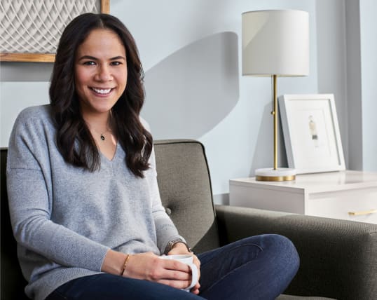
When it comes to decorating, Real Simple home editor Leslie Corona believes that less is more. Here, she reveals how she turned the living room in her Brooklyn apartment into a cozy space using the ColorSnap® Color ID Minimalist Palette from Sherwin-Williams®.

Leslie Corona Image

Inspiring Readers

As a home editor, I’m always looking for ways to help my readers, from writing about simple organizing hacks to encouraging people to incorporate more color into their homes. I see a lot of different design aesthetics in my day-to-day work, but I’m personally drawn to well-balanced spaces—rooms that aren’t overflowing with stuff, but still have a bit of personality thanks to pops of color or quirky décor.

Crushed Ice

sw 7647

Krypton

sw 6247

Snowbound

sw 7004

Urbane Bronze

sw 7048

Finding My Personal Palette

I knew I wanted my apartment to be a calming space since city living can be very overwhelming, but I wasn’t sure where to start. So, I took the Color ID quiz from Sherwin-Williams for a bit of inspiration and got matched with the Color ID Minimalist palette. This was spot-on for me because I approach decorating with a very light hand. I was also excited to see that I could easily pair any of the 16 shades.

I don’t have a lot of stuff in my apartment because clutter stresses me out. I like when a room has space to breathe, so I try to be intentional with home décor. If something doesn’t immediately fill me with joy, or I don’t have a purpose for it, then I probably don’t need it. I also prefer to decorate my space with things that are tied to a happy memory, like family photos on the wall and souvenirs from trips with my husband.
Personal Palette Image

I’m personally drawn to well-balanced spaces—rooms that aren’t overflowing with stuff, but still have a bit of personality thanks to pops of color or quirky décor.”

Designing a Cozy Escape Image

Designing a Cozy Escape

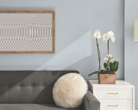
When I’m not working or running around, I like to watch movies with my husband and spend time curled up on the couch with a coloring book in the living room. It’s where I go to unwind, so I wanted to use a relaxing paint color. I chose Krypton SW 6247 for the wall because it’s more interesting than white—but still light and neutral enough to work with everything else in the room.

You’ll find other shades like the ones in the Color ID Minimalist palette throughout this room: The sofa is gray, I have some tan throw pillows, and my rug is a light blue. I also painted my side table using Snowbound SW 7004. I like how this shade looks against the Krypton—there’s something really serene about the combination, which is the vibe I want for my apartment.

the Minimalist Palette

  • Essential Gray

    sw 6002

  • Folkstone

    sw 6005

  • Snowbound

    sw 7004

  • Anew Gray

    sw 7030

  • Elephant Ear

    sw 9168

  • Reflection

    sw 7661

  • Magnetic Gray

    sw 7058

  • Silverpointe

    sw 7653

  • Krypton

    sw 6247

  • Dutch Cocoa

    sw 6032

  • Light French
    Gray

    sw 0055

  • Downing Slate

    sw 2819

  • Crushed Ice

    sw 7647

  • Unfussy Beige

    sw 6043

  • Urbane Bronze

    sw 7048

  • Morris Room
    Grey

    sw 0037