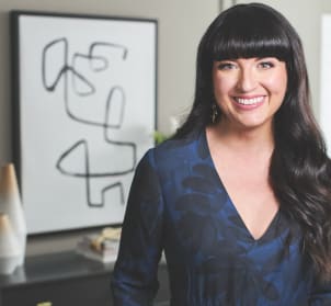
Color is at the forefront of Jennifer Stagg’s design process. As a blogger and co-owner of a design firm, she believes the home is the most important place in the world—and that color can help transform any room into a personalized space. Below, Jennifer chats about the power of personal style and how she used the ColorSnap® Color ID Nurturer palette from Sherwin-Williams® to turn her home into a cozy escape.
This content was produced for Sherwin-Williams by the foundry @ Meredith Corp. Real Simple editorial staff was not involved in its creation or production.
Embracing the Nurturer Palette
I took the Color ID quiz from Sherwin-Williams and discovered that my ideal palette is the Nurturer. I really identify with this, since welcoming friends and family into my home is how I show them I love them. This palette is soothing and comfortable, which is exactly how I want my home to feel. Plus, these neutral shades will never go out of style and you can use them throughout the entire home—which is important because a huge part of my design philosophy is creating cohesive spaces.
I wanted to carry colors, patterns, and themes from one room to the next, so using a palette that is designed to be mixed and matched brought my project to life. Throughout our home you’ll find shades like the ones in the Color ID Nurturer palette: Our fireplace mantle is a warm beige, and there are grays and blues throughout, like our sofa and throw pillows.
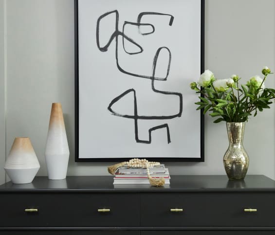

Creating a Cozy Sanctuary
I like my bedroom to be a peaceful space where my husband and I can read, talk, and snuggle. The Color ID Nurturer palette was perfect for us because its earth tones instantly put us at ease. I used Sensible Hue SW 6198 on the walls and Iron Ore SW 7069 on the dresser, and then pulled in the other shades with throw pillows and a chair that sits in the corner of the room.
When I walk into this space, I just want to change into my comfy clothes and relax. Even better, my husband loves it, too.
To find your palette personality, take the Color ID quiz from Sherwin-Williams at swcolorid.com.